Starliche
A refined, architectural visual identity designed for a premium furniture brand; balancing classic sophistication with contemporary minimalist design.
Starliche
A refined, architectural visual identity designed for a premium furniture brand; balancing classic sophistication with contemporary minimalist design.
About
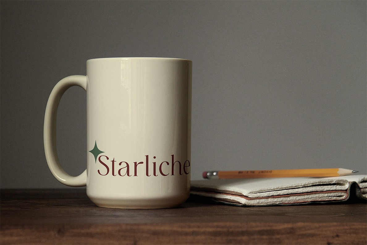
Starliche required a visual ecosystem that reflects its positioning in the premium furniture market. The design concept centers on structural elegance, clean spatial geometry, and an understated color palette that complements high-end interior spaces. By balancing a refined, timeless serif wordmark with minimalist secondary elements, the identity echoes the brand’s core philosophy: that furniture is not just functional, but an architectural statement of art and craftsmanship.
Year
June 2023
Date
June 2023
Date
June 2023
Industry
Luxury Lifestyle
Industry
Luxury Lifestyle
Industry
Luxury Lifestyle
Type of work
Brand Identity / Creative Direction / Web Design
Type of work
Brand Identity / Creative Direction / Web Design
Type of work
Brand Identity / Creative Direction / Web Design
Timeline
2 Weeks
Timeline
2 Weeks
Timeline
2 Weeks
Challenges
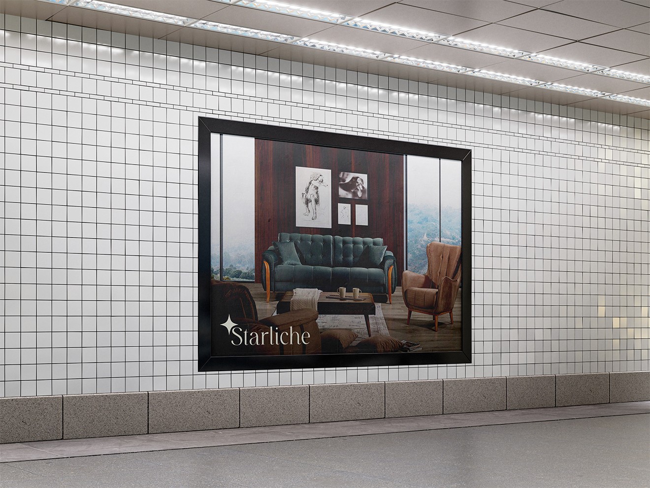
The primary challenge was translating the rich, tactile presence of premium furniture into a cohesive digital experience. High-end interior brands rely heavily on scale, texture, and physical atmosphere, qualities that can easily become lost on a flat screen. The visual system needed to bridge this gap, ensuring that the brand identity remained uncompromisingly elegant whether displayed on large-scale physical advertising or compressed into a minimalist, fast-loading digital web interface.
Challenges
The primary challenge was translating the rich, tactile presence of premium furniture into a cohesive digital experience. High-end interior brands rely heavily on scale, texture, and physical atmosphere, qualities that can easily become lost on a flat screen. The visual system needed to bridge this gap, ensuring that the brand identity remained uncompromisingly elegant whether displayed on large-scale physical advertising or compressed into a minimalist, fast-loading digital web interface.
Challenges
The primary challenge was translating the rich, tactile presence of premium furniture into a cohesive digital experience. High-end interior brands rely heavily on scale, texture, and physical atmosphere, qualities that can easily become lost on a flat screen. The visual system needed to bridge this gap, ensuring that the brand identity remained uncompromisingly elegant whether displayed on large-scale physical advertising or compressed into a minimalist, fast-loading digital web interface.
The process
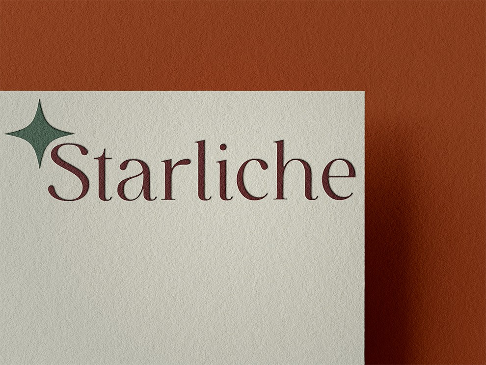
The creative process centered on structural minimalism. Beginning with the curation of the serif wordmark and the development of the four-point star asset, the identity was designed to act as a quiet mark of quality that never competes with the furniture photography. From there, the layout system was engineered using generous whitespace, editorial typography, and an asymmetrical grid. This approach allowed the brand assets to mirror the experience of walking through an artfully curated showroom, clean, intentional, and focused entirely on the craftsmanship of the pieces.
The process
The creative process centered on structural minimalism. Beginning with the curation of the serif wordmark and the development of the four-point star asset, the identity was designed to act as a quiet mark of quality that never competes with the furniture photography. From there, the layout system was engineered using generous whitespace, editorial typography, and an asymmetrical grid. This approach allowed the brand assets to mirror the experience of walking through an artfully curated showroom, clean, intentional, and focused entirely on the craftsmanship of the pieces.
The process
The creative process centered on structural minimalism. Beginning with the curation of the serif wordmark and the development of the four-point star asset, the identity was designed to act as a quiet mark of quality that never competes with the furniture photography. From there, the layout system was engineered using generous whitespace, editorial typography, and an asymmetrical grid. This approach allowed the brand assets to mirror the experience of walking through an artfully curated showroom, clean, intentional, and focused entirely on the craftsmanship of the pieces.
The outcome
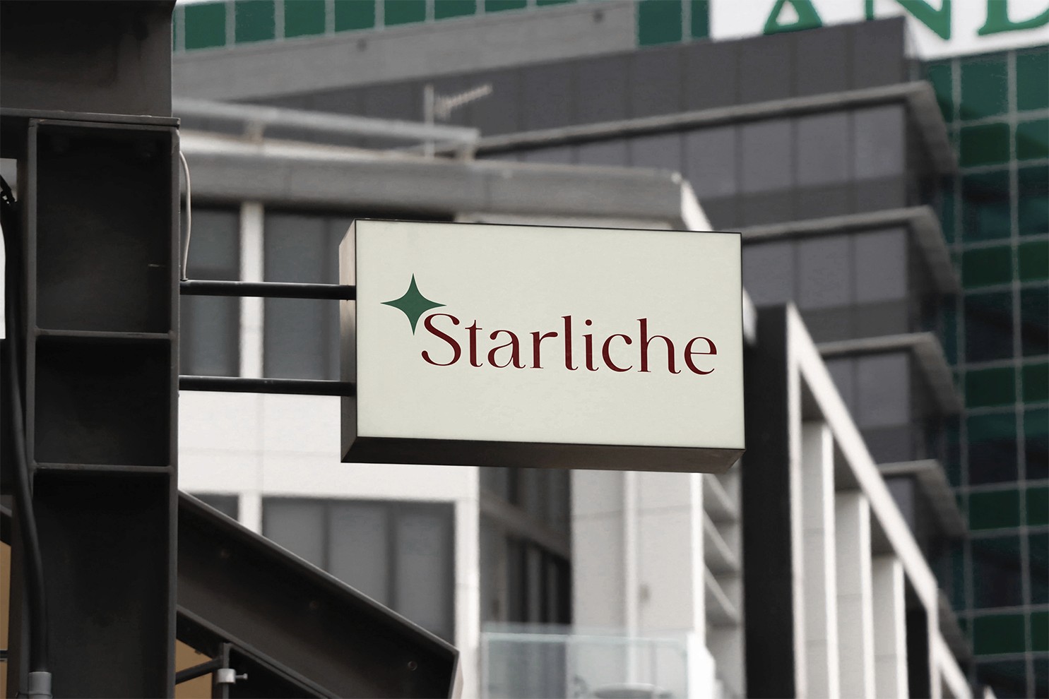
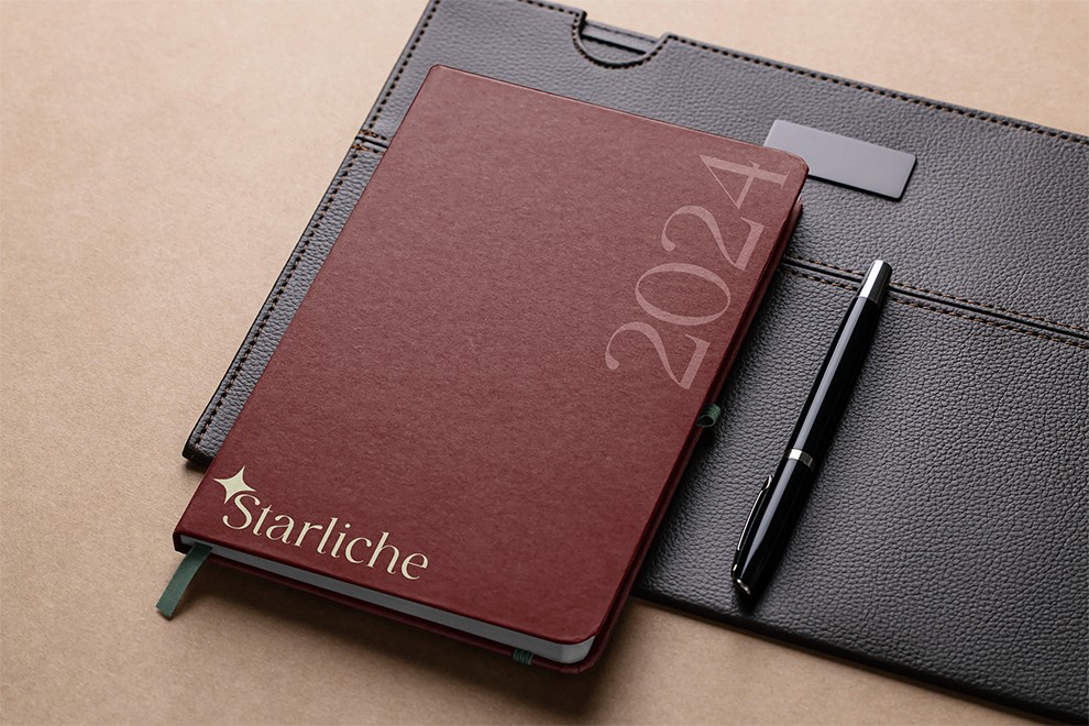
The final outcome delivers an understated, premium brand identity that successfully positions Starliche at the pinnacle of the furniture market. From architectural exterior signage to corporate stationery and high-end editorial collateral, the visual system maintains an authoritative yet quiet elegance. By relying on exquisite typography, tactile material textures, and generous whitespace, the brand achieves an enduring presence that mirrors the timeless quality and structural craftsmanship of the furniture itself.
The outcome
The final outcome delivers an understated, premium brand identity that successfully positions Starliche at the pinnacle of the furniture market. From architectural exterior signage to corporate stationery and high-end editorial collateral, the visual system maintains an authoritative yet quiet elegance. By relying on exquisite typography, tactile material textures, and generous whitespace, the brand achieves an enduring presence that mirrors the timeless quality and structural craftsmanship of the furniture itself.
The outcome
The final outcome delivers an understated, premium brand identity that successfully positions Starliche at the pinnacle of the furniture market. From architectural exterior signage to corporate stationery and high-end editorial collateral, the visual system maintains an authoritative yet quiet elegance. By relying on exquisite typography, tactile material textures, and generous whitespace, the brand achieves an enduring presence that mirrors the timeless quality and structural craftsmanship of the furniture itself.