Oppikoppi
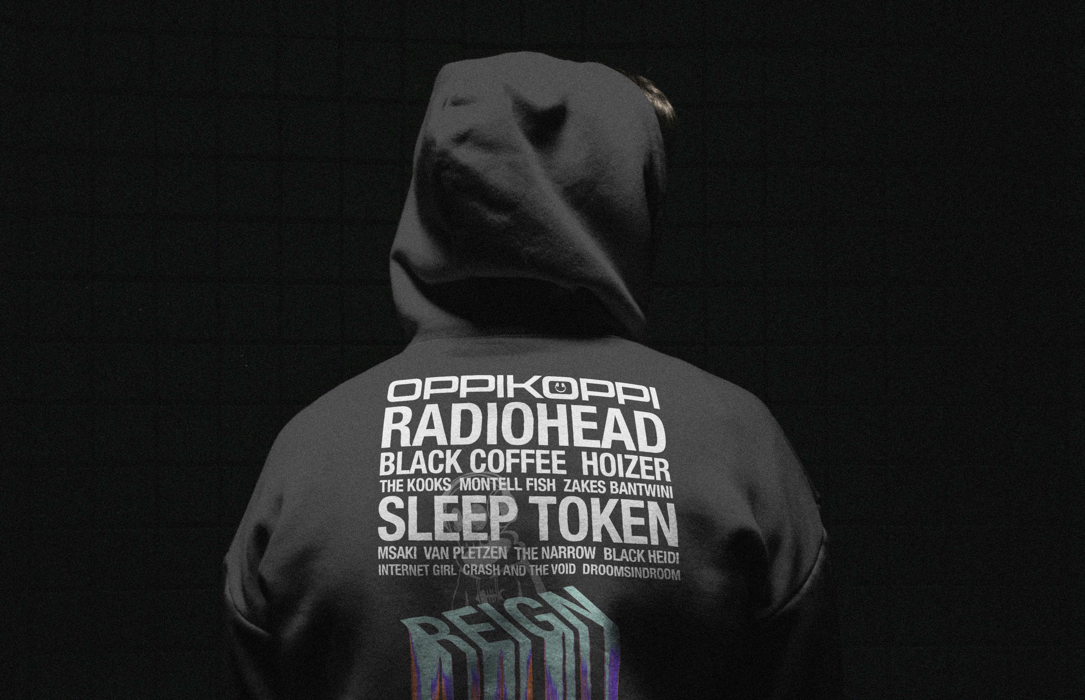
A gritty, high-voltage identity concept designed for South Africa’s legendary music festival; blending bold typography, raw textures, and youth culture apparel.
Oppikoppi
A gritty, high-voltage identity concept designed for South Africa’s legendary music festival; blending bold typography, raw textures, and youth culture apparel.
About
Tasked with reimagining the visual language for one of South Africa’s most iconic music festivals, this concept redefines the energetic chaos of Oppikoppi. The design strategy centers on a raw, tactile aesthetic tailored for a modern, subculture-driven audience. By cutting through conventional corporate design structures, the project explores the intersection of bold typography, underground gig poster heritage, and contemporary streetwear apparel to build a cohesive, high-voltage festival identity.
Year
June 2025
Date
June 2025
Date
June 2025
Industry
Entertainment & Culture
Industry
Entertainment & Culture
Industry
Entertainment & Culture
Type of work
Case Study / Concept
Type of work
Case Study / Concept
Type of work
Case Study / Concept
Timeline
3 Weeks
Timeline
3 Weeks
Timeline
3 Weeks
Challenges
The primary challenge lay in capturing the raw, unpredictable energy of a multi-genre music festival without losing visual cohesion. The identity needed to be versatile enough to frame legendary international rock acts alongside pioneering local electronic artists. Balancing intense distortion, heavy textures, and massive typographic hierarchies required a disciplined layout strategy to ensure festival lineups, dates, and sponsor structures remained sharply legible amidst the intentional visual chaos.
Challenges
The primary challenge lay in capturing the raw, unpredictable energy of a multi-genre music festival without losing visual cohesion. The identity needed to be versatile enough to frame legendary international rock acts alongside pioneering local electronic artists. Balancing intense distortion, heavy textures, and massive typographic hierarchies required a disciplined layout strategy to ensure festival lineups, dates, and sponsor structures remained sharply legible amidst the intentional visual chaos.
Challenges
The primary challenge lay in capturing the raw, unpredictable energy of a multi-genre music festival without losing visual cohesion. The identity needed to be versatile enough to frame legendary international rock acts alongside pioneering local electronic artists. Balancing intense distortion, heavy textures, and massive typographic hierarchies required a disciplined layout strategy to ensure festival lineups, dates, and sponsor structures remained sharply legible amidst the intentional visual chaos.
The process
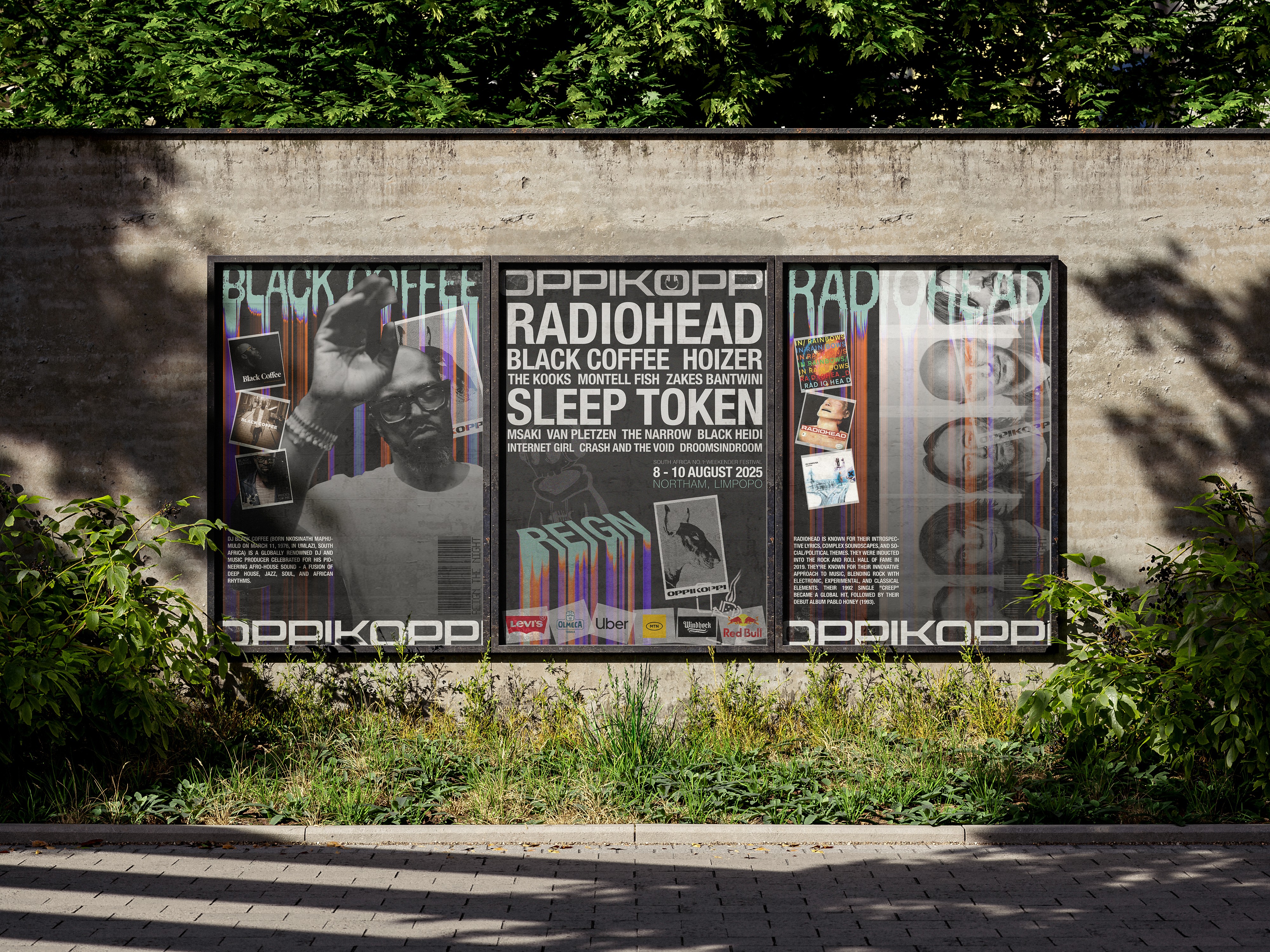
The creative process began by treating the festival assets like underground street art. Moving away from clean digital vectors, the workflow embraced heavy image degradation, half-tone textures, and chromatic distortion to evoke the feeling of old-school gig posters peeling off city walls. By pairing artist-specific imagery with a rigid, custom-designed grid, the resulting triptych system feels unified as a singular brand experience while giving each individual poster its own distinct, high-voltage voice.
The process
The creative process began by treating the festival assets like underground street art. Moving away from clean digital vectors, the workflow embraced heavy image degradation, half-tone textures, and chromatic distortion to evoke the feeling of old-school gig posters peeling off city walls. By pairing artist-specific imagery with a rigid, custom-designed grid, the resulting triptych system feels unified as a singular brand experience while giving each individual poster its own distinct, high-voltage voice.
The process
The creative process began by treating the festival assets like underground street art. Moving away from clean digital vectors, the workflow embraced heavy image degradation, half-tone textures, and chromatic distortion to evoke the feeling of old-school gig posters peeling off city walls. By pairing artist-specific imagery with a rigid, custom-designed grid, the resulting triptych system feels unified as a singular brand experience while giving each individual poster its own distinct, high-voltage voice.
The outcome
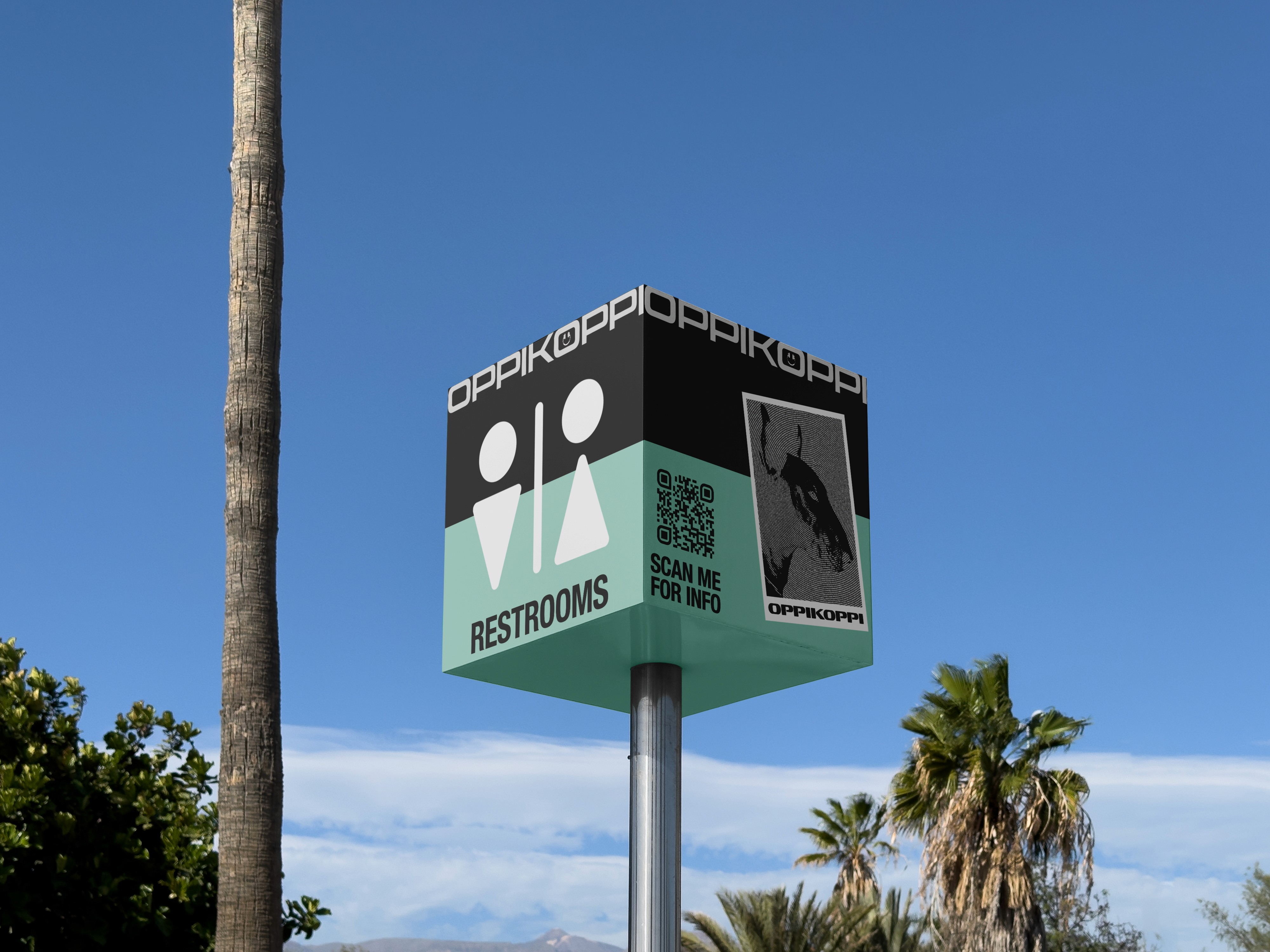
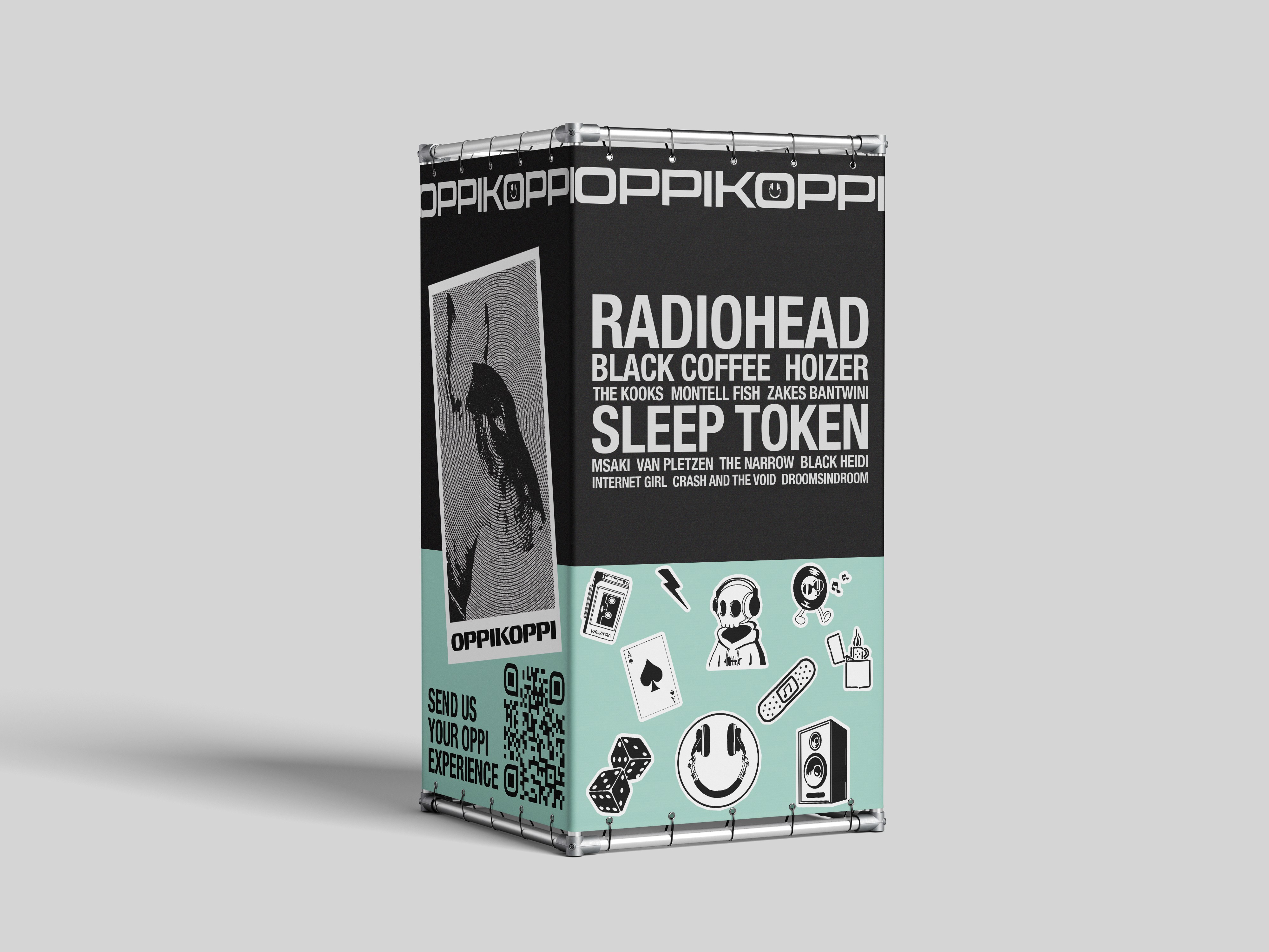
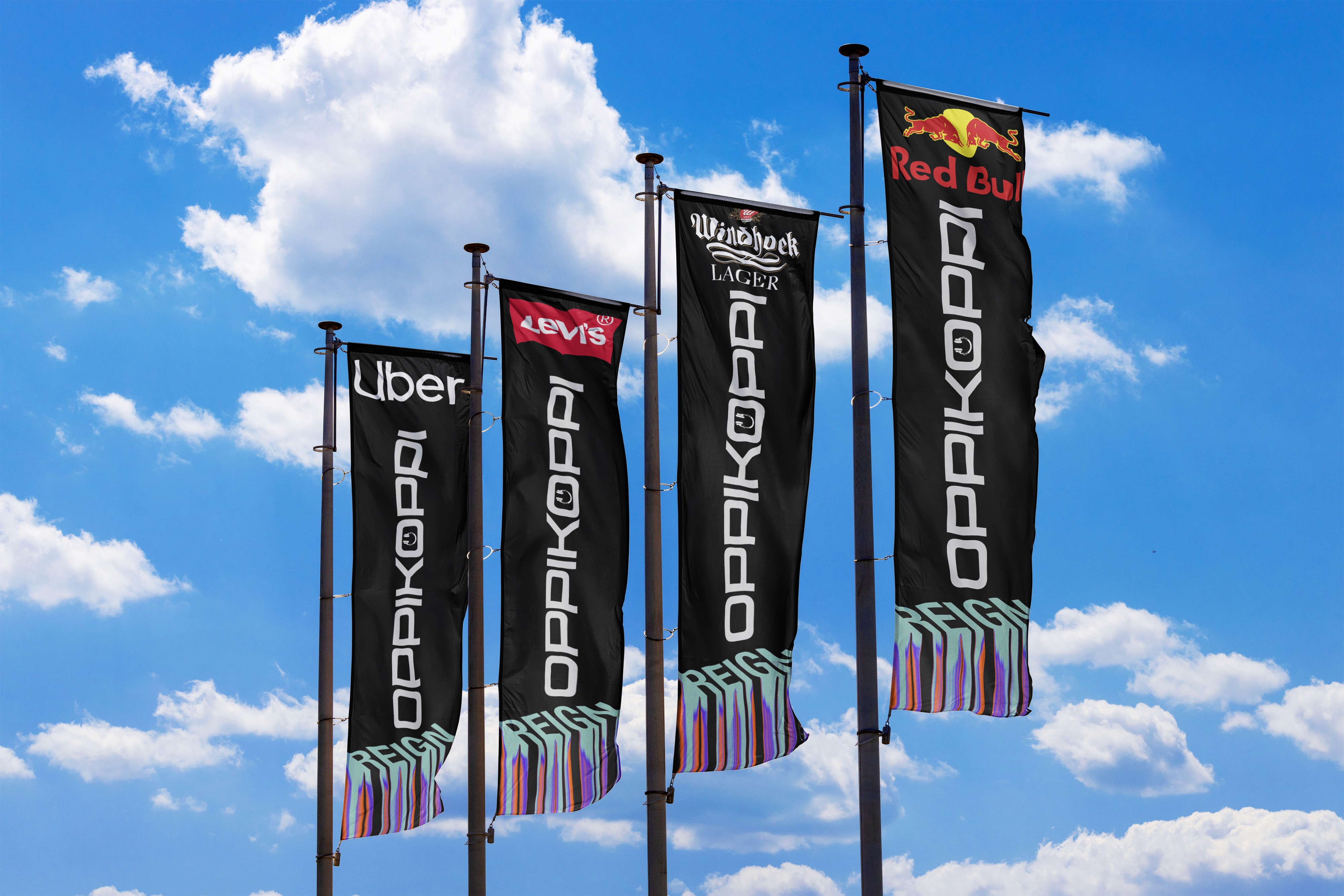
The final concept delivers an immersive, uncompromised visual ecosystem that anchors the Oppikoppi experience across both physical and promotional spaces. From high-visibility environmental wayfinding to large-scale festival flags and merchandise pillars, the identity maintains a fierce, unmistakable presence. By seamlessly integrating sponsorship placement into a gritty, youth-centric design system, the outcome proves that festival branding can remain wildly creative, authentic to its subculture, and structurally cohesive all at once.
The outcome
The final concept delivers an immersive, uncompromised visual ecosystem that anchors the Oppikoppi experience across both physical and promotional spaces. From high-visibility environmental wayfinding to large-scale festival flags and merchandise pillars, the identity maintains a fierce, unmistakable presence. By seamlessly integrating sponsorship placement into a gritty, youth-centric design system, the outcome proves that festival branding can remain wildly creative, authentic to its subculture, and structurally cohesive all at once.
The outcome
The final concept delivers an immersive, uncompromised visual ecosystem that anchors the Oppikoppi experience across both physical and promotional spaces. From high-visibility environmental wayfinding to large-scale festival flags and merchandise pillars, the identity maintains a fierce, unmistakable presence. By seamlessly integrating sponsorship placement into a gritty, youth-centric design system, the outcome proves that festival branding can remain wildly creative, authentic to its subculture, and structurally cohesive all at once.