Menar
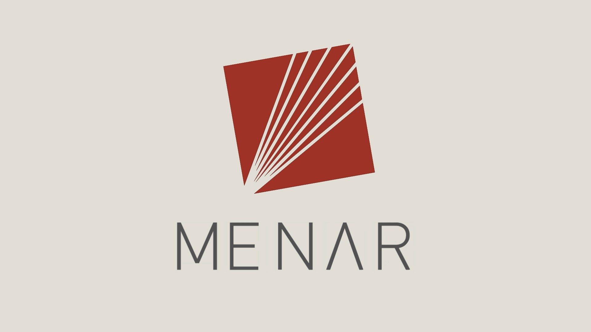
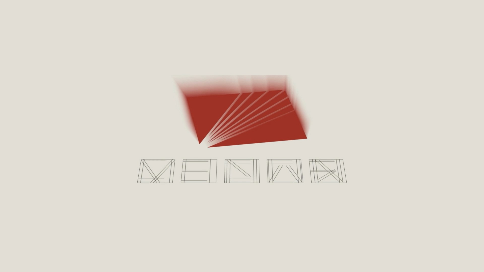
A breakdown of the static design system in high resolution. Each composition captures the logo’s geometric transitions, framing the identity as a monolithic and timeless visual anchor.
Menar
A breakdown of the static design system in high resolution. Each composition captures the logo’s geometric transitions, framing the identity as a monolithic and timeless visual anchor.
About
Bringing architectural geometry into dynamic environments. The motion language maps every shifting vector intersection, ensuring that the visual system maintains its strict structural integrity and flawless legibility across all digital touchpoints.
Year
March 2026
Date
March 2026
Date
March 2026
Industry
Industrial Investment & Holdings
Industry
Industrial Investment & Holdings
Industry
Industrial Investment & Holdings
Type of work
Brand Identity / Creative Direction / Web Design
Type of work
Brand Identity / Creative Direction / Web Design
Type of work
Brand Identity / Creative Direction / Web Design
Timeline
2 Weeks
Timeline
2 Weeks
Timeline
2 Weeks
Challenges
The task focused on breathing dynamic life into a heavy, institutional mark designed for high-end corporate ecosystems. The motion language needed to communicate absolute stability and capital strength, transforming rigid geometric vectors into a dynamic, forward-looking visual system without losing the brand's established authority.
Challenges
The task focused on breathing dynamic life into a heavy, institutional mark designed for high-end corporate ecosystems. The motion language needed to communicate absolute stability and capital strength, transforming rigid geometric vectors into a dynamic, forward-looking visual system without losing the brand's established authority.
Challenges
The task focused on breathing dynamic life into a heavy, institutional mark designed for high-end corporate ecosystems. The motion language needed to communicate absolute stability and capital strength, transforming rigid geometric vectors into a dynamic, forward-looking visual system without losing the brand's established authority.
The process
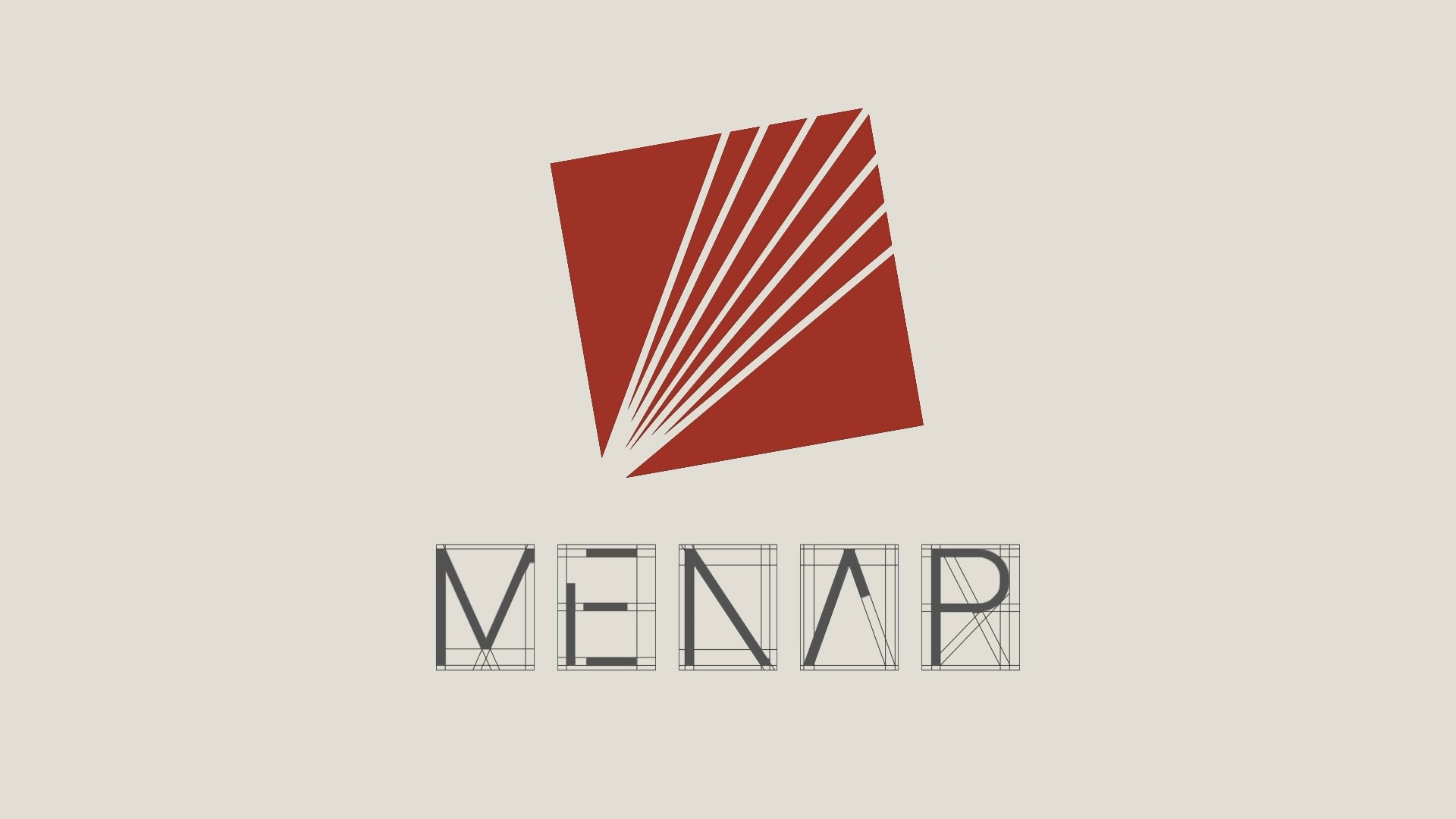
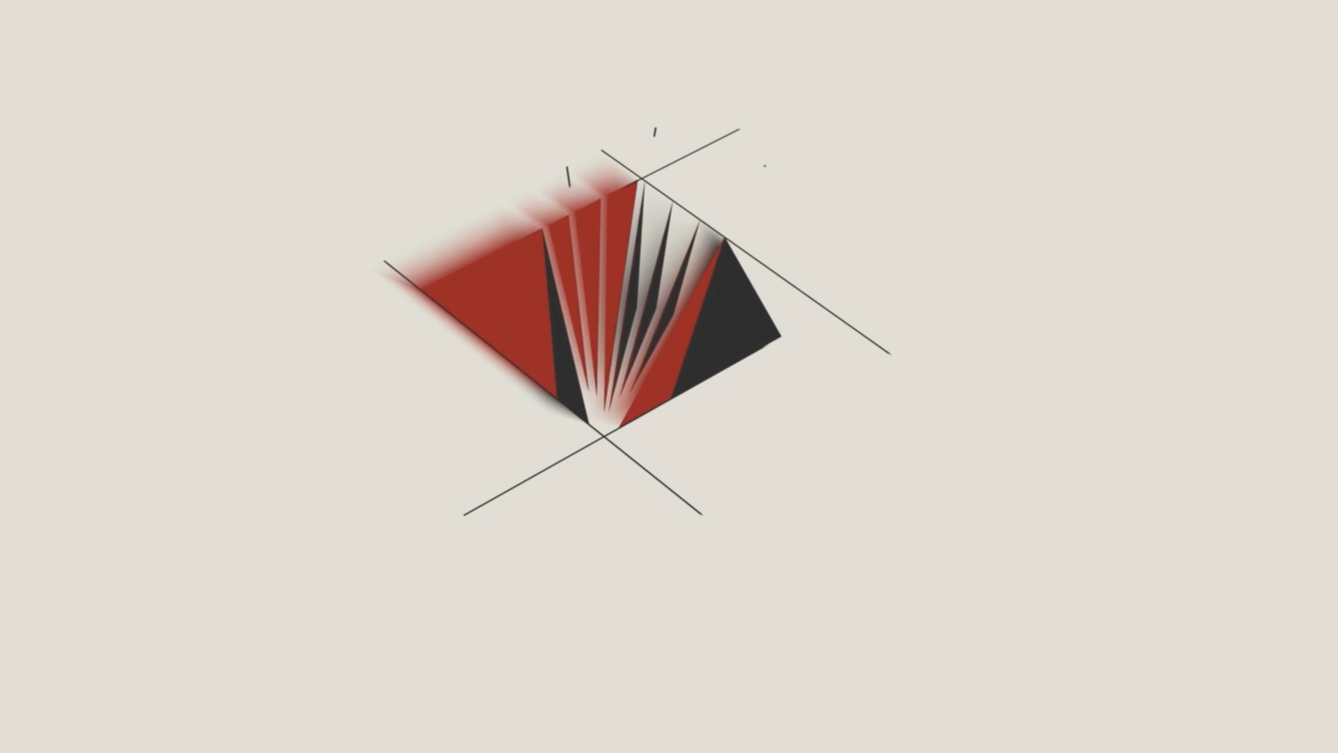
The animation system breaks down the static emblem into its foundational components. By isolating the individual structural lines, the choreography maps the precise moment of intersection where raw geometric data converges to form a unified, monolithic anchor.
The process
The animation system breaks down the static emblem into its foundational components. By isolating the individual structural lines, the choreography maps the precise moment of intersection where raw geometric data converges to form a unified, monolithic anchor.
The process
The animation system breaks down the static emblem into its foundational components. By isolating the individual structural lines, the choreography maps the precise moment of intersection where raw geometric data converges to form a unified, monolithic anchor.
The outcome
A commanding motion identity that seamlessly bridges legacy prestige with a forward-looking digital presence. By transforming a fixed mark into a responsive asset, the finalized animation gives the brand an uncompromising graphic weight, delivering a premium, high-contrast visual rhythm engineered to anchor digital presentations, key corporate touchpoints, and institutional media.
The outcome
A commanding motion identity that seamlessly bridges legacy prestige with a forward-looking digital presence. By transforming a fixed mark into a responsive asset, the finalized animation gives the brand an uncompromising graphic weight, delivering a premium, high-contrast visual rhythm engineered to anchor digital presentations, key corporate touchpoints, and institutional media.
The outcome
A commanding motion identity that seamlessly bridges legacy prestige with a forward-looking digital presence. By transforming a fixed mark into a responsive asset, the finalized animation gives the brand an uncompromising graphic weight, delivering a premium, high-contrast visual rhythm engineered to anchor digital presentations, key corporate touchpoints, and institutional media.